
Imagine it’s Saturday morning. You have two days, a laptop, and a looming deadline to show recruiters what you can actually do. For many UK students is a demographic facing intense competition in the graduate job market, requiring digital proof of skills beyond academic transcripts. A CV is static; a portfolio is alive. But building one doesn’t require coding expertise or a £500 budget. It requires strategy, simplicity, and a weekend of focused effort.
The goal here isn’t to build a complex web application. It’s to create a professional, accessible, and visually coherent space that houses your best work. Whether you’re studying graphic design, engineering, or business, your online presence acts as your first interview. Recruiters spend an average of seven seconds scanning a profile before deciding if they care more. Your site needs to hook them immediately.
Why a Portfolio Matters More Than Your CV
A CV lists what you did; a portfolio shows how you did it. In the UK higher education landscape, employers increasingly look for evidence of practical application. If you claim you are creative, show me a project. If you say you are analytical, show me a case study with data visualizations. This shift from assertion to demonstration is critical for standing out.
Consider the difference between saying "I am proficient in Python" and linking to a GitHub repository where you built a script that automated data cleaning for a local charity. The latter provides tangible proof. For non-technical roles, this might mean linking to a written report, a presentation deck, or a video walkthrough of a group project. The medium changes, but the principle remains: show, don't just tell.
Furthermore, a personal domain looks significantly more professional than a subdomain on a free hosting platform. While not strictly necessary for a first draft, owning your own name (e.g., yourname.com) signals seriousness. It also ensures that if you change platforms later, your link stays valid forever. This longevity is a small detail that adds up to a larger impression of reliability.
Choosing the Right Platform: No-Code vs. Code
You have three main paths: no-code builders, open-source CMS, or custom code. For a weekend project, speed and ease of use should dictate your choice. Unless you are a computer science student specifically looking to showcase coding skills, avoid raw HTML/CSS unless you enjoy debugging for hours.
| Platform | Best For | Cost (Monthly) | Learning Curve | Key Limitation |
|---|---|---|---|---|
| Squarespace is a premium website builder known for its polished, designer-friendly templates and integrated e-commerce capabilities. | Creative fields (Design, Art, Media) | £13 - £23 | Low | Less flexible for technical demos |
| Wix is a drag-and-drop website builder offering extensive customization options and a vast app marketplace. | All-rounders who want full control | £9 - £20 | Medium | Can become cluttered if over-customized |
| WordPress is the world's most popular content management system, powering over 40% of all websites globally. | Blogging + Portfolio hybrid | £0 - £10 (hosting) | High | Requires maintenance and plugin management |
| GitHub Pages is a free static site hosting service provided by GitHub, ideal for developers to host documentation and projects directly from repositories. | Computer Science & Engineering | Free | Medium-High | Steep learning curve for non-devs |
If you are a visual thinker, Squarespace offers the cleanest aesthetic with the least effort. Its templates are designed to look good even with minimal input. Wix gives you more freedom to place elements exactly where you want them, which is great if you have a specific layout in mind. WordPress is powerful but heavy; it’s better suited if you plan to write regular blog posts alongside your portfolio. For CS students, GitHub Pages is the industry standard because it demonstrates version control knowledge while hosting your code.
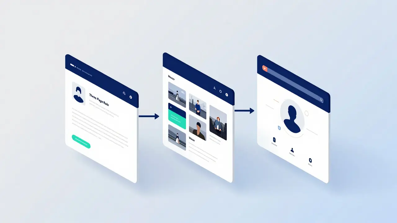
Structuring Your Content: The Three-Page Rule
Resist the urge to create ten different pages. Recruiters are busy. They want to see your best work quickly. Stick to a maximum of three core pages: Home, Work, and About. Everything else can be linked externally or housed within these sections.
- Home Page: This is your elevator pitch. Include a clear headline stating who you are and what you do (e.g., "Final Year Design Student Specializing in UX"). Add a short, punchy bio (under 100 words). Place a call-to-action button that leads directly to your work. Avoid generic hero images; use a high-quality headshot or a collage of your top three projects.
- Work Page: This is the meat of your site. Curate, don't dump. Select only your top 3-5 projects. Quality beats quantity. Each project should have a title, a brief context (what was the problem?), your role, and the outcome. Use screenshots, videos, or links to live demos. Keep descriptions concise-bullet points work well here.
- About Page: Humanize yourself. Talk about your background, your interests outside of school, and why you chose your field. Include a downloadable CV/PDF resume. List your key skills and tools. Add social links (LinkedIn, GitHub, Behance) so recruiters can verify your identity elsewhere.
Navigation should be intuitive. A simple menu bar at the top or bottom is sufficient. Don’t hide important information behind confusing dropdowns. Mobile responsiveness is non-negotiable; over 60% of traffic comes from mobile devices. Test your site on your phone before you send it out.
The Weekend Execution Plan
Here is a realistic timeline to get this done without burning out. Assume you have Friday evening and all day Saturday and Sunday.
- Friday Evening (2 Hours): Planning & Setup. Buy your domain if needed. Sign up for your chosen platform. Choose a template. Write down the text for your bio and project descriptions. Do not start designing yet. Get the words on paper first. This prevents the common mistake of trying to design around bad copy.
- Saturday Morning (3 Hours): Content Creation. Upload your images. Ensure they are optimized for the web (compressed to under 200KB per image to keep load times fast). Write your project case studies. Focus on clarity. Use active voice. "I designed..." not "The design was created by...".
- Saturday Afternoon (3 Hours): Design & Layout. Drag and drop elements into place. Customize fonts and colors. Stick to a limited color palette (2-3 colors max). Ensure consistent spacing. This is where you make it look professional. Spend time here, but set a timer. Perfectionism is the enemy of completion.
- Sunday Morning (2 Hours): Testing & Feedback. Click every link. Check for typos. View the site on your phone, tablet, and desktop. Send the URL to a friend or mentor. Ask them: "What is the first thing you notice? Can you find my email? Does anything feel broken?" Incorporate their feedback.
- Sunday Afternoon (1 Hour): Final Polish & Launch. Make final tweaks. Publish the site. Update your LinkedIn profile to include the link. Add the link to your CV. Take a screenshot of the homepage for your records. You are done.
This schedule leaves buffer time for unexpected issues, like a font not loading or an image being too large. By Sunday afternoon, you will have a live, professional portfolio that you can reference in every application for the next six months.

Common Pitfalls to Avoid
Even with a good plan, students often stumble on a few recurring mistakes. Being aware of them saves time and preserves credibility.
Too much text. People scan, they don't read. Break up paragraphs. Use headers. If a paragraph is longer than four lines, split it. White space is your friend; it makes the content easier to digest.
Broken links. Nothing kills trust faster than a 404 error. Before publishing, click every single link on your site. This includes buttons, images, and footer links. One broken link suggests a lack of attention to detail.
Ignoring SEO basics. You don’t need to rank #1 on Google for "best student," but you should be findable. Use descriptive page titles (e.g., "Jane Doe | UX Designer Portfolio" instead of "Home"). Add alt text to your images. This helps accessibility and search engines understand your content.
Outdated content. A portfolio is not a museum. If you finish a new project, update your site. Remove old, weak projects if they no longer represent your current skill level. Stale content suggests you aren't actively working.
Measuring Success Beyond Views
How do you know if your portfolio is working? Don’t obsess over analytics dashboards in the first month. Instead, track qualitative outcomes. Did you get more interviews after adding the link to your CV? Did a recruiter mention your specific project in a feedback email? These are the real metrics.
Set up a simple contact form or provide a direct email address. Monitor your inbox for inquiries. If you hear nothing for a month, it might be time to refine your messaging or add stronger examples. A portfolio is a living tool; it should evolve as you do. Treat it as part of your career toolkit, not a one-time assignment.
By treating your website as a professional asset rather than a school project, you signal maturity and initiative. In a crowded job market, that distinction can be the difference between getting an interview and staying in the pile. You have the skills; now you have the stage. Go build it.
Do I need to buy a custom domain?
It is highly recommended. A custom domain (like yourname.co.uk) looks more professional and remains yours forever, even if you switch website builders. It costs less than £10 per year and significantly boosts credibility with recruiters.
How many projects should I include?
Aim for 3 to 5 high-quality projects. Quality is far more important than quantity. Each project should demonstrate a different skill or solve a distinct problem. If you have more than five, choose the ones that best align with the jobs you are applying for.
Is WordPress too complicated for a beginner?
For a pure portfolio, yes, it can be overkill. WordPress requires managing plugins, themes, and updates. Unless you plan to write frequent blog posts, a simpler platform like Squarespace or Wix will save you time and reduce technical headaches during your weekend build.
Should I include my GPA on the website?
Generally, no. Your portfolio is about your practical skills and personality. Save your grades for your CV. On the website, focus on your experience, projects, and soft skills. Recruiters care more about what you have built than what score you achieved in a lecture hall.
How do I optimize images for the web?
Use free tools like TinyPNG or Compressor.io to compress images before uploading them. Aim for file sizes under 200KB for standard images. Use WebP format if possible, as it loads faster than JPEG or PNG. Fast loading speeds improve user experience and search engine rankings.