Key Takeaways for Data Presentation
- Prioritize clarity over complexity to avoid confusing the marker.
- Always link your visuals directly to your written analysis.
- Follow strict ethical guidelines to avoid accusations of data manipulation.
- Use standardized formatting (like APA or Harvard) for all captions and labels.
- Ensure every chart has a clear source to maintain academic integrity.
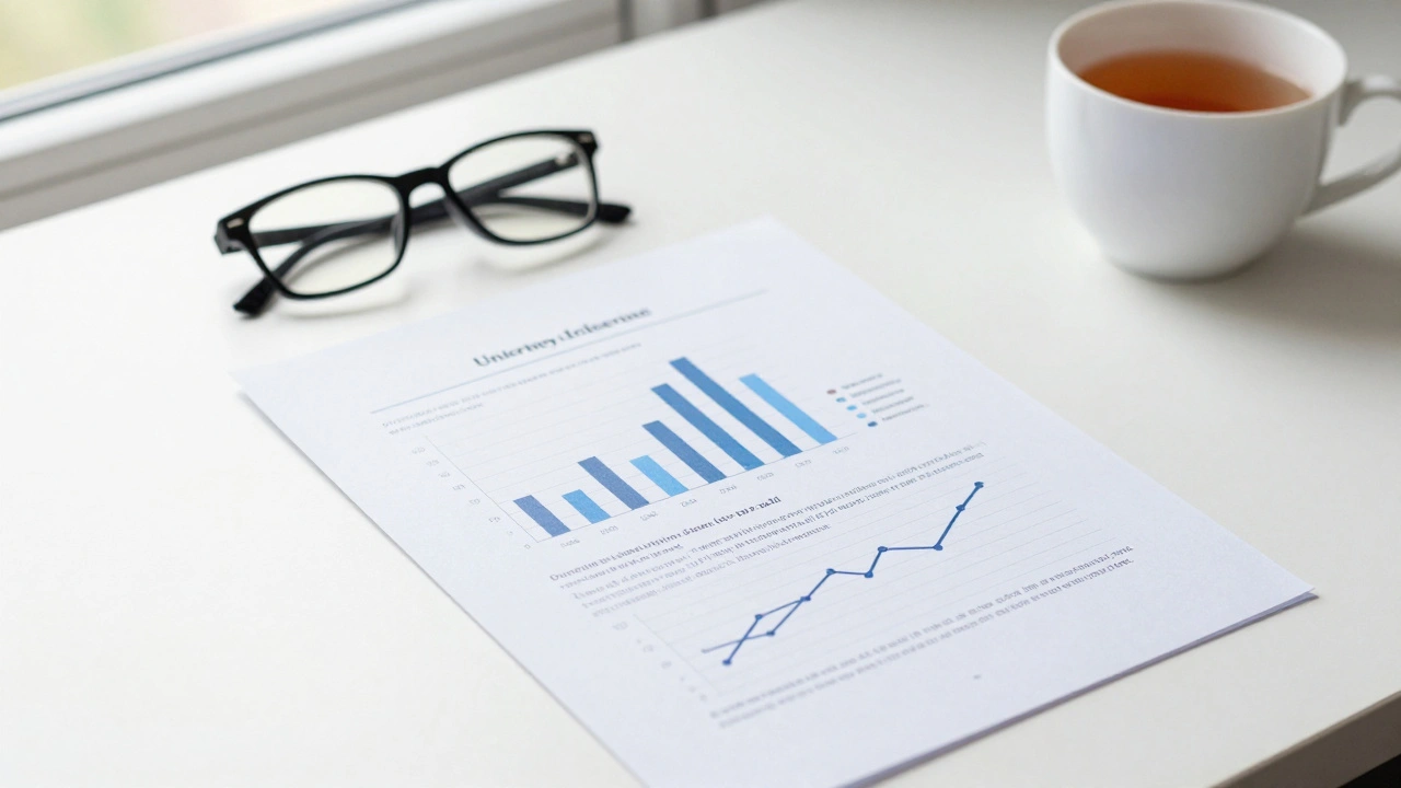
When you're staring at a massive spreadsheet and wondering how to turn it into a grade-winning chart, the first thing to remember is that your marker is looking for data presentation in assignments that supports a logical narrative. They don't want to play a guessing game with your X-axis. The goal is to reduce the cognitive load on the person reading your work. If they have to spend more than ten seconds figuring out what a bar represents, the visual has failed.
Choosing the Right Visual for Your Story
Not every dataset fits into a pie chart. In fact, using the wrong visual is one of the fastest ways to look like an amateur. For instance, Pie Charts are a circular statistical graphic divided into slices to illustrate numerical proportion. They are great for showing a simple part-to-whole relationship, but the moment you have more than five categories, they become unreadable. If you're comparing the market share of six different UK retailers, a horizontal bar chart is far more effective because our eyes are better at comparing lengths than angles.
If you're tracking changes over time, a Line Graph is a type of chart used to visualize a trend in data points created by connecting them with straight line segments. This is your go-to for showing growth or decline, such as the rise of inflation in the UK between 2020 and 2025. The key here is consistency. If you're plotting monthly data over three years, don't skip months on the axis just to make the line look steeper; that's a fast track to an ethics violation.
| Data Goal | Recommended Chart | Why it Works | Common Pitfall |
|---|---|---|---|
| Comparing Categories | Bar Chart | Easy length comparison | Using a non-zero baseline |
| Showing Trends | Line Graph | Visualizes continuity | Overcrowding with too many lines |
| Proportions | Pie Chart / Treemap | Shows part-to-whole | Too many small slices |
| Correlation | Scatter Plot | Shows relationship between variables | Assuming correlation equals causation |
The Ethics of Data Visualization
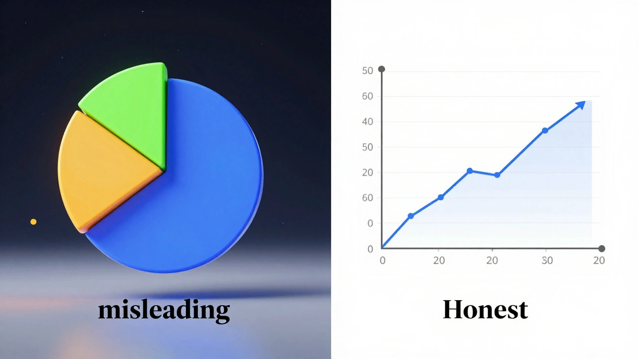
In the UK, Academic Integrity is the moral code of academia that requires students to produce their own work and honestly report findings. When it comes to charts, ethics isn't just about not lying; it's about not misleading. A common trick in corporate marketing is the 'truncated axis'-starting a Y-axis at 50 instead of 0 to make a small increase look like a massive spike. In a university assignment, this is considered intellectually dishonest. You must represent the scale of your data accurately, even if it makes your results look less 'exciting'.
Another ethical grey area is 'cherry-picking'. This happens when a student selects only the data points that support their hypothesis and ignores the ones that contradict it. To avoid this, you should report the full dataset or provide a clear justification in your methodology section for why certain outliers were excluded. If you're using Quantitative Research, which is the systematic empirical investigation of observable phenomena via statistical, mathematical, or numerical data, your transparency is what gives your work authority.
Formatting and Labeling for High Marks
A chart without a label is just a drawing. Every visual in your assignment must be self-explanatory. This means every axis needs a title and a unit of measurement. Instead of just writing "Price," write "Price in GBP (£)". This small detail shows the marker that you're thinking about the reader's experience.
Referencing your visuals is where most students lose easy points. You cannot simply drop a chart into a document and hope the marker notices it. You must use a 'call-out' in your text. For example, instead of saying "See the chart below," say "As illustrated in Figure 3, the correlation between student debt and mental health suggests a positive trend." This connects your visual evidence directly to your argument.
For the actual layout, follow these rules of thumb:
- Captions: Place the figure number and a descriptive title below the image (e.g., Figure 1: Average House Prices in London 2021-2025).
- Consistency: Use the same font and color palette throughout the whole document. Mixing neon green charts with pastel blue ones looks messy and unprofessional.
- Sizing: Ensure the chart is large enough to be legible but doesn't take up a whole page unless it's an incredibly complex matrix.
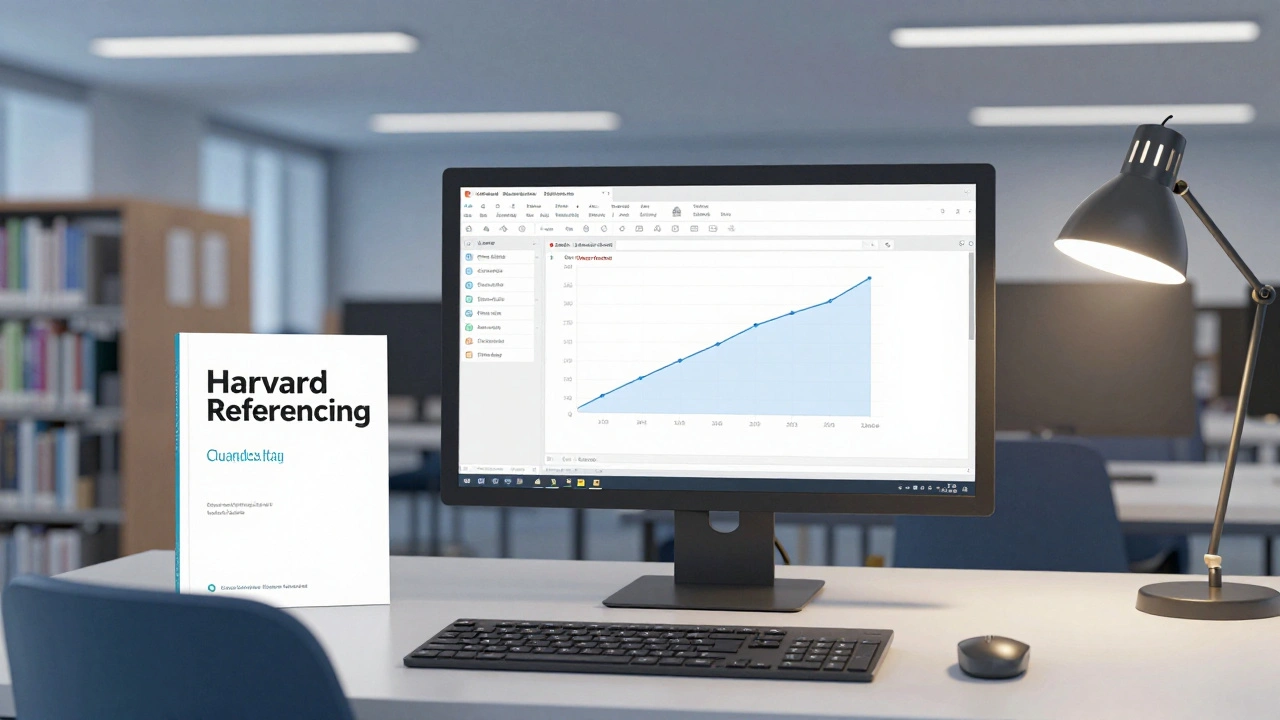
- Source: If the data isn't yours, cite it immediately under the chart. Use Harvard Referencing, a widely used system of referencing that uses author-date citations in the text and a full bibliography at the end, or whatever style your department requires.
Common Pitfalls and How to Fix Them
One of the biggest mistakes is the 'data dump'. This is when a student includes five different charts in a row without any analysis. Remember, the chart is the evidence, but your writing is the interpretation. For every visual you include, you should spend at least one paragraph explaining what the data means and why it matters to your overall thesis.
Another issue is the use of 3D effects. 3D pie charts or 3D bars might look 'modern', but they actually distort the data. The angle of a 3D slice makes it look larger than it actually is, which brings us back to the ethics of misleading visuals. Stick to 2D. It's cleaner, more professional, and more accurate.
Finally, watch out for 'chartjunk'. This is any visual element that doesn't help the reader understand the data. Heavy grid lines, distracting background images, and overly decorative borders all distract from the actual numbers. Strip everything away until only the data and the necessary labels remain.
Can I use screenshots of charts from a website?
It is generally better to recreate the chart yourself using the raw data. This allows you to control the formatting and ensures the quality is high. If you must use a screenshot, you must cite it as a figure and provide a full reference to the original source. However, be warned that low-resolution images can look unprofessional and may lower your grade.
Where should I put large data tables?
If a table is longer than half a page, it usually disrupts the flow of the reading. In this case, place a summary table in the main text and move the full, detailed dataset to the Appendices section at the end of your assignment. In your text, simply refer to it by saying "(see Appendix A for full data)".
What is the difference between a Figure and a Table?
In academic writing, a Table consists of rows and columns of data. A Figure is any other visual element, including charts, graphs, photographs, diagrams, or maps. They are labeled differently: Tables are usually labeled at the top, while Figures are labeled at the bottom.
Is it okay to round numbers in my charts?
Yes, but be consistent. If you round to two decimal places in one chart, do the same in all others. Avoid rounding so aggressively that you change the meaning of the data. Always mention the level of precision in your methodology or a footnote if it's a critical part of your analysis.
What happens if my data doesn't support my hypothesis?
This is actually a great opportunity for critical analysis. In UK universities, markers value honesty and critical thinking over 'perfect' results. Present the data exactly as it is, and then discuss why it differs from your expectations. This shows you are an objective researcher, which often leads to higher marks than simply finding the 'right' answer.
Next Steps for Your Assignment
If you are just starting your data phase, begin by cleaning your data in a tool like Excel or Google Sheets. Remove duplicates and ensure your units are consistent. Once your data is clean, create a rough draft of your charts to see which ones actually tell the story you want to tell.
For students in the final editing phase, do a 'visual audit'. Flip through your assignment and look only at the charts. Do they look consistent? Are they all labeled? If you can't understand a chart without reading the surrounding three pages of text, you need to simplify the visual or improve the labels. Finally, double-check your citations against your university's specific style guide to ensure every figure is properly credited.